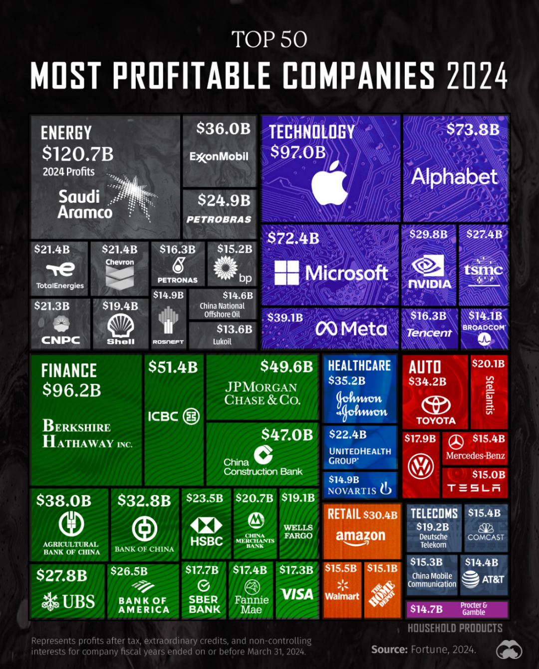
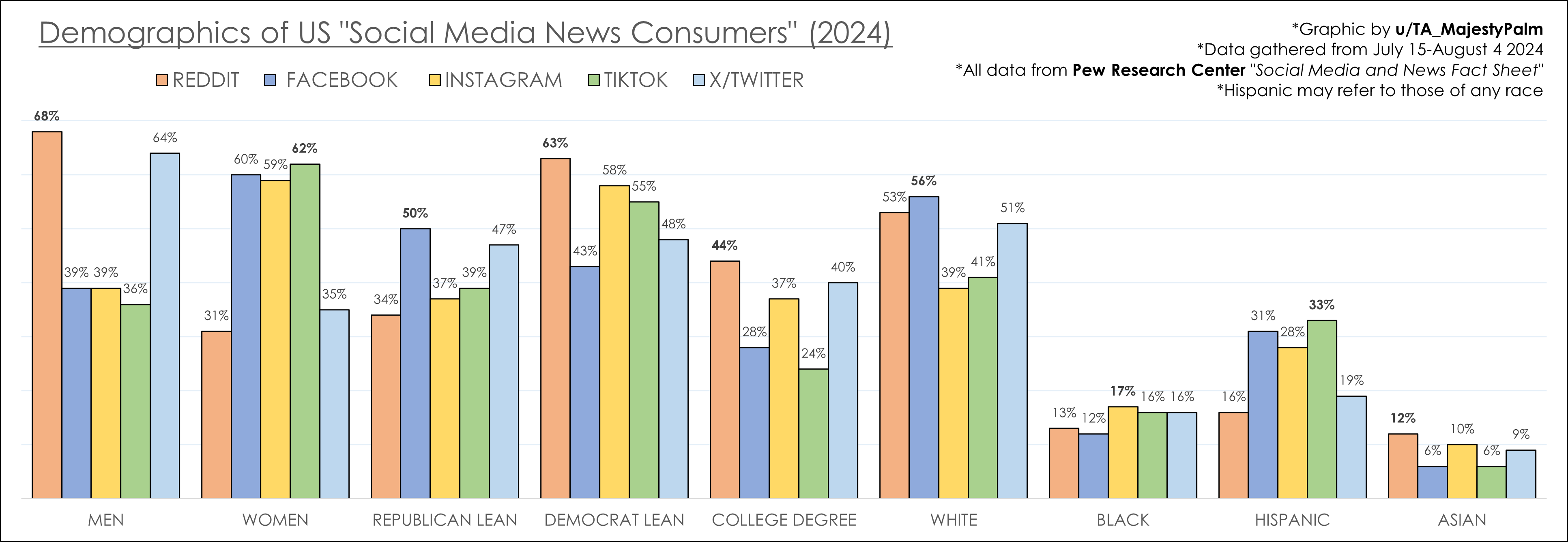
Ever wondered why some visuals captivate your attention while others fall flat?
Understanding the six principles of design can transform your visuals from mundane to magnificent, ensuring they stand out in any context.
In this article, we'll delve into these essential principles, including balance, contrast, emphasis, proportion, unity, and movement, to help you create stunning and effective visuals that engage and inspire.
Ready to elevate your design skills and make your visuals unforgettable?
Let's dive in!
Understanding Balance in Design
Balance in design refers to the equal distribution of visual weight in a composition. It ensures that no single part of the design overpowers the other, creating a sense of stability and harmony.
Types of balance include:
- Symmetrical Balance: Mirroring elements on either side of an axis.
- Asymmetrical Balance: Using different elements to achieve visual equilibrium.
- Radial Balance: Arranging elements around a central point.
In practical applications, symmetrical balance is often used in corporate designs and formal layouts. It provides a clean, orderly look, ideal for logos and business cards. For example, a logo with symmetrical balance might feature identical shapes or text on either side of a central line, creating a polished and professional appearance.
Asymmetrical balance, on the other hand, is more dynamic and interesting. It uses contrasting elements—such as different sizes, colors, or textures—to create a balanced yet visually engaging composition. This type of balance is frequently seen in modern and contemporary designs, where creativity and uniqueness are emphasized. An example would be a website layout that places a large image on one side and smaller text blocks on the other, balancing the visual weight through contrast.
Radial balance is less common but highly effective in creating focal points. It arranges elements around a central point, drawing the viewer's eye towards the center. This technique is often used in designs that need to emphasize a particular element, such as a central logo or a featured product in an advertisement. A practical example is a circular infographic where all the data points radiate from the center, guiding the viewer's attention naturally.
Understanding and applying these types of balance can significantly enhance the effectiveness and aesthetic appeal of any design project.
The Role of Contrast in Design
Contrast in design highlights differences between elements to create visual interest. It emphasizes distinctions, making certain parts of a design stand out and catch the viewer's eye.
Methods to achieve contrast include:
- Colors: Using opposite colors on the color wheel.
- Textures: Combining rough and smooth surfaces.
- Shapes: Pairing large and small forms.
- Lines: Contrasting thick and thin lines.
Practical applications of contrast are abundant in both web and graphic design. For instance, using contrasting colors can make a call-to-action button stand out on a webpage, guiding users toward desired actions. A website with a dark background might use bright, bold text to ensure readability and draw attention to key information.
In print design, contrast can be used to create a dynamic composition. A magazine cover might feature a mix of large, bold headlines and smaller, intricate details to capture the reader's interest. Textures can also play a significant role; for example, a business card might combine a smooth, matte finish with glossy, embossed text to create a tactile experience that stands out.
By effectively employing contrast, designers can enhance the visual appeal and functionality of their work, making it not only more engaging but also easier to navigate and understand.
Emphasis: Drawing Attention in Design
Emphasis in design is about making a particular element stand out, capturing the viewer's attention. This can be achieved through variations in size, color, or placement, guiding the viewer’s eye to the focal point.
Techniques to achieve emphasis include:
- Size: Larger elements draw more attention.
- Color: Bright or contrasting colors make elements pop.
- Placement: Positioning elements strategically to highlight importance.
Practical applications of emphasis are widespread in various design fields. For instance, in web design, emphasis can be used to ensure that call-to-action buttons are noticeable. A large, brightly colored button placed prominently on the page can significantly increase user engagement and conversion rates.
In graphic design, emphasis is often used to create a visual hierarchy. A poster might feature a large, bold headline at the top to grab attention, while supporting information is presented in smaller text below. This technique ensures that the viewer first notices the most critical message.
Examples of effective emphasis can also be found in advertising. A product advertisement might use a vibrant color palette to make the product image stand out against a neutral background, drawing the viewer's eye directly to the item being promoted. By skillfully applying emphasis, designers can create visually compelling and effective designs that communicate their intended message clearly and powerfully.
Proportion: Ensuring Visual Harmony
Proportion in design refers to the size relationship between different elements within a composition. It is crucial for creating visual harmony, ensuring that all parts of the design feel balanced and cohesive.
Proportional relationships are achieved through various strategies, including size, ratio, and divisions. By carefully adjusting these aspects, designers can create a sense of order and unity in their work. For example, the golden ratio is a well-known proportional strategy that has been used in art and architecture for centuries to achieve aesthetically pleasing results.
Practical applications of proportion are evident in numerous design projects. In web design, maintaining proportional relationships between text, images, and other elements ensures that the layout is visually appealing and easy to navigate. For instance, a well-proportioned website might use larger headings to draw attention to key sections, while maintaining smaller text for detailed content, creating a clear visual hierarchy.
In graphic design, proportion is essential for creating balanced compositions. A poster, for example, might use a large central image with proportionally smaller text and additional graphics to guide the viewer's eye through the design. By applying proportional strategies, designers can enhance the overall impact and effectiveness of their work.
The Importance of Unity in Design
Unity in design is the sense of cohesiveness that ensures all elements work together to create a unified whole. It is achieved through consistency in style, color, and typography, making the design appear harmonious and well-organized.
Techniques to achieve unity include:
- Consistent Style: Using similar design elements throughout the composition.
- Color Harmony: Applying a consistent color palette to create a cohesive look.
- Typography Consistency: Utilizing matching fonts and text styles across the design.
In practical applications, unity is crucial for branding and identity design. For example, a company's marketing materials—such as business cards, brochures, and websites—should all use the same color scheme, typography, and visual style to create a cohesive brand image. This consistency helps build brand recognition and trust among consumers.
Another example of unity can be found in web design. A website that uses a consistent layout, color scheme, and typography across all its pages provides a seamless user experience. Visitors can easily navigate the site and understand the brand's message, leading to increased engagement and satisfaction. For instance, an e-commerce website might use the same button styles, fonts, and color palette on every page to ensure a unified and professional appearance.
In graphic design, unity can be achieved by maintaining a consistent visual theme. A magazine layout, for example, might use the same grid system, margin sizes, and font styles throughout its pages. This approach ensures that each page feels like part of a cohesive whole, making the publication more visually appealing and easier to read.
By focusing on unity, designers can create visually stunning and effective designs that communicate their message clearly and cohesively.
Movement: Guiding the Viewer’s Eye
Movement in design is the principle that guides the viewer’s eye through the composition. It often leads to the focal point using lines, shapes, or repetition, enhancing the narrative by directing attention.
Techniques to create movement include:
- Lines: Using lines to lead the eye in a specific direction.
- Shapes: Arranging shapes to create a path for the viewer’s eye.
- Repetition: Repeating elements to suggest motion and guide the viewer.
Practical applications of movement are seen in various design projects. For instance, in web design, movement can be created through the strategic use of lines and shapes to guide users from one section of a webpage to another. A common example is the use of arrows or diagonal lines that lead the eye towards important content, such as a call-to-action button.
In graphic design, movement is often used in poster layouts to create a dynamic flow. For example, a designer might use a series of repeated elements, such as circles or arrows, to lead the viewer's eye from the top of the poster to the bottom, ensuring that all information is noticed in sequence. Additionally, the use of curved lines can create a sense of motion, making the design feel more lively and engaging.
By effectively applying these techniques, designers can create compositions that not only capture attention but also guide the viewer through the information in a purposeful and engaging manner.
Final Words
Understanding the six principles of design is crucial for creating effective and engaging visuals.
Balance ensures equal distribution of visual weight.
Contrast highlights differences to draw attention.
Emphasis creates focal points.
Proportion maintains harmony among elements.
Unity brings cohesiveness, and Movement guides the viewer's eye.
By mastering these principles, designers can enhance their work, making it more impactful and visually appealing.
The 6 Principles of Design serve as a foundation for any successful visual composition, ensuring every element works together seamlessly.
Embrace these concepts to elevate your design projects and captivate your audience.


