Does the Spider-Man symbol really define the hero?
Tracing its origins from 1962's debut in Amazing Fantasy #15, this iconic emblem has undergone numerous transformations.
From Steve Ditko's simple design to Jim Starlin's influence on 1970s merchandise, each iteration reflects a piece of Spider-Man's enduring legacy.
This article delves deep into the evolution of the Spider-Man symbol, examining how subtle shifts and bold redesigns shaped one of the most recognizable logos in all of comic lore.
Interested in discovering how a mere symbol evolved through decades while defining Spider-Man's identity?
Read on.
The Early Years of the Spider-Man Symbol (1962-1978)
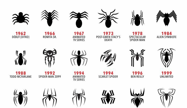
Spider-Man, created by Stan Lee and Steve Ditko, made his first appearance in Amazing Fantasy #15 in August 1962. The original design by Steve Ditko featured a simple yet iconic spider symbol placed prominently on Spider-Man's chest. This initial design emphasized a straightforward, black spider with elongated legs, which became instantly recognizable and set the foundation for future adaptations.
In 1966, John Romita Sr. introduced slight modifications to the symbol. These changes included a more detailed and refined spider design, aligning with Romita's overall artistic style that aimed for a more polished look. The 1967 animated TV series brought another variation of the symbol, adjusting its size and placement to fit the animation style and technological limitations of the time. These adjustments were subtle but significant, as they helped the symbol transition from the comic book pages to the television screen.
Significant changes or adaptations during this period:
- 1962: Original design by Steve Ditko with a simple black spider.
- 1966: John Romita Sr.'s refined and more detailed spider design.
- 1967: Animated TV series variation with adjusted size and placement.
- 1969: Jim Starlin's new logo design for merchandise.
- 1978: Continued use and slight modifications of Starlin's design.
Between 1969 and 1978, Jim Starlin designed the logo used on most Spider-Man merchandise. This design maintained the core elements of Ditko's original concept but incorporated slight modifications to make it more visually appealing and versatile for various products. Starlin's influence ensured that the Spider-Man symbol remained consistent and recognizable across different mediums, solidifying its place in pop culture.
The Evolution During the 1980s
The 1980s marked a significant shift in the visual identity of Spider-Man, starting with the introduction of the alien symbiote suit in 1984. This new suit featured a black and white spider symbol, which was a stark departure from the traditional red and blue costume. The black suit, first appearing in The Amazing Spider-Man #252, symbolized a darker and more complex side of Spider-Man's character. The design was simple yet striking, with a large white spider stretching across the chest and back, creating a bold and memorable look. This change not only refreshed Spider-Man's appearance but also added depth to his storyline, introducing the symbiote that would later become the infamous villain, Venom.
In 1988, Todd McFarlane brought another transformative redesign to the Spider-Man symbol. McFarlane's version featured a more detailed and dramatic spider, with elongated legs and a more prominent presence on the costume. This redesign first appeared in The Amazing Spider-Man #298 and quickly became iconic. McFarlane's artistic style emphasized intricate details and dynamic poses, which translated into a more visually impactful symbol. The changes he introduced helped set the tone for the character's evolution in the late 80s and solidified his influence on Spider-Man's visual legacy.
| Year | Design Change |
|---|---|
| 1984 | Introduction of the alien symbiote suit with a black and white spider symbol |
| 1988 | Todd McFarlane’s redesign with a more detailed and dramatic spider |
| 1988 | First appearance of McFarlane’s redesign in The Amazing Spider-Man #298 |
| 1989 | Further refinement of the spider symbol under McFarlane’s influence |
## The 1990s: New Characters and New Symbols
The 1990s ushered in a wave of innovation for the Spider-Man symbol, starting with the introduction of Spider-Man 2099 in 1992. This futuristic take on the iconic character featured a symbol that deviated significantly from the classic design. The Spider-Man 2099 symbol showcased a stylized, skeletal spider with extended legs that wrapped around the torso, creating a more aggressive and edgy look. This design was reflective of the darker, cyberpunk-inspired world that Spider-Man 2099 inhabited, setting it apart from the traditional red and blue costume.
In 1994, the Scarlet Spider made his debut, bringing another unique symbol into the Spider-Man universe. The Scarlet Spider, also known as Ben Reilly, sported a red spider symbol emblazoned on a blue hoodie. Unlike the classic design, this symbol was more minimalist, with a simple, clean outline that emphasized the raw and less polished nature of the character. This design choice highlighted the Scarlet Spider's status as a clone and his struggle to find his own identity separate from Peter Parker.
Ben Reilly took on the mantle of Spider-Man in 1996, and with it came another distinct symbol. Reilly's Spider-Man suit featured a more intricate and modernized spider symbol, characterized by a larger and more detailed spider that extended across his chest and back. This design aimed to differentiate Reilly's Spider-Man from Peter Parker's, while still maintaining the core elements that fans recognized and loved. The symbol's bold lines and enhanced detailing gave it a contemporary feel, aligning with the evolving aesthetics of the 90s.
The 1999 Unlimited series presented yet another new take on the Spider-Man symbol. This version reimagined the symbol to fit the show's futuristic setting and animation style. The Unlimited symbol was sleek and streamlined, with a focus on symmetry and sharp angles. It maintained the essence of the original spider design but adapted it to suit the high-tech world and dynamic action sequences of the series. This iteration demonstrated the symbol's versatility and its ability to evolve with different interpretations of the Spider-Man character.
- Spider-Man 2099: Stylized, skeletal spider with extended legs.
- Scarlet Spider: Minimalist red spider on a blue hoodie.
- Ben Reilly's Spider-Man: Larger, detailed spider with bold lines.
- Unlimited Series: Sleek, symmetrical design with sharp angles.
The 2000s: From Comics to Movies
The 2000s marked a significant evolution for the Spider-Man symbol, beginning with the Ultimate Spider-Man comic series in 2000. This series introduced a sleek, modern version of the symbol, designed to appeal to a new generation of readers. The updated symbol featured a more streamlined and stylized spider, with longer legs and a more dynamic pose. This redesign aimed to reflect the contemporary and youthful tone of the Ultimate Spider-Man series, setting it apart from the classic design while maintaining the core elements that fans recognized.
In 2002, the Spider-Man symbol made its cinematic debut in the Spider-Man movie directed by Sam Raimi. This version of the symbol was brought to life with a 3D design, adding depth and realism to the iconic spider emblem. The 3D effect made the symbol stand out on the big screen, emphasizing its importance as a central element of Spider-Man's suit. This adaptation not only captured the essence of the comic book symbol but also enhanced it to fit the visual demands of a blockbuster film.
The 2004 sequel, Spider-Man 2, maintained the same 3D symbol design with slight refinements. The minor adjustments focused on improving the overall aesthetics and functionality of the suit, ensuring that the symbol looked even more striking during the film's high-flying action sequences. These refinements demonstrated the filmmakers' commitment to staying true to the original design while continuously enhancing it for cinematic purposes.
In 2006, the introduction of the Iron Spider suit in the comics brought a tech-inspired twist to the Spider-Man symbol. This new suit, designed by Tony Stark, featured a symbol that was more intricate and futuristic, reflecting the advanced technology integrated into the suit. The Iron Spider symbol was characterized by its sharp lines and metallic sheen, distinguishing it from the traditional spider emblem and aligning it with the high-tech theme of the suit.
The 2007 film Spider-Man 3 showcased yet another iteration of the symbol with the introduction of the black suit. This suit, influenced by the alien symbiote, featured a black and white version of the spider symbol, similar to the one seen in the 1984 comic storyline. The black suit symbol was bold and menacing, highlighting the darker aspects of Spider-Man's character as he struggled with the symbiote's influence. This adaptation brought a fresh yet familiar take on the symbol, resonating with long-time fans and new audiences alike.
| Year | Medium | Symbol Characteristics |
|---|---|---|
| 2000 | Ultimate Spider-Man comics | Sleek, modern, and stylized spider |
| 2002 | Spider-Man movie | 3D design with depth and realism |
| 2004 | Spider-Man 2 movie | Refined 3D symbol for cinematic effect |
| 2006 | Iron Spider suit in comics | Intricate, tech-inspired, with sharp lines |
| 2007 | Spider-Man 3 movie | Black and white symbol, bold and menacing |
## The 2010s: A Decade of Diversity and Innovation
In 2011, the character of Miles Morales was introduced in Ultimate Fallout #4. Miles Morales' Ultimate Spider-Man featured a new symbol that distinguished him from Peter Parker. The symbol was a sleeker, more modern take on the classic design, with a black spider on a red and black suit. This redesign aimed to reflect the fresh and youthful energy of Morales as a new Spider-Man for a new generation.
The 2012 Amazing Spider-Man movie brought another redesigned symbol to the big screen. This version featured a more elongated and angular spider, which fit the film's darker and grittier tone. The symbol was designed to be more visually striking and to stand out against the suit's textured pattern, enhancing the overall aesthetic of the movie's Spider-Man.
In 2014, The Amazing Spider-Man 2 movie introduced yet another version of the symbol. This design was closer to the classic look but incorporated modern elements to make it appear more dynamic. The spider symbol was larger and more prominent, emphasizing Spider-Man's presence and agility. This iteration balanced nostalgia with contemporary design, appealing to both long-time fans and new audiences.
The 2016 Captain America: Civil War movie featured a tech-enhanced symbol on Spider-Man’s suit, designed by Tony Stark. This version had a more intricate design with subtle technological details that reflected the suit's advanced capabilities. The symbol was smaller and more streamlined, fitting seamlessly into the high-tech aesthetic of the Marvel Cinematic Universe.
In 2018, Avengers: Infinity War introduced the latest designs for the Spider-Man symbol, both in the movie and in Marvel's Spider-Man PS4 Game. These designs featured a more robust and detailed spider, with a focus on symmetry and sharp lines. The PS4 game's symbol was particularly notable for its bold white color, contrasting sharply against the red suit and adding a modern twist to the classic design.
The 2018 animated film Spider-Man: Into the Spider-Verse showcased multiple versions of the Spider-Man symbol, reflecting the diverse range of Spider-People from different dimensions. Each version retained the core elements of the spider symbol but adapted them to fit the unique styles and personalities of characters like Spider-Gwen, Spider-Ham, and Peni Parker. This creative approach highlighted the versatility and enduring appeal of the Spider-Man symbol across different interpretations.
Finally, the 2019 Spider-Man: Far From Home movie featured the latest iteration of the symbol. This version combined elements from previous designs, creating a cohesive and modern look. The symbol was bold and sleek, perfectly complementing the updated suit's aesthetic and functionality. This design emphasized Spider-Man's growth and evolution as a character within the Marvel Cinematic Universe.
- Miles Morales' Ultimate Spider-Man: Sleek, modern black spider on a red and black suit.
- 2012 Amazing Spider-Man movie: Elongated, angular spider fitting a darker tone.
- 2014 Amazing Spider-Man 2 movie: Larger, dynamic spider blending classic and modern elements.
- 2016 Captain America: Civil War movie: Tech-enhanced, intricate design with subtle technological details.
- 2018 Avengers: Infinity War movie: Robust, symmetrical spider with sharp lines.
- Marvel's Spider-Man PS4 Game: Bold white spider contrasting against a red suit.
- 2018 Spider-Man: Into the Spider-Verse movie: Multiple versions reflecting diverse Spider-People.
- 2019 Spider-Man: Far From Home movie: Bold, sleek design combining previous elements.
Comparing Spider-Man Symbols Across Media
The Spider-Man symbol has undergone numerous variations across comics, TV series, movies, and video games. In comics, the symbol has evolved from Steve Ditko's original 1962 design to more modern interpretations like the sleek, tech-enhanced versions seen in the Ultimate series. TV adaptations, such as the 1967 animated series and the 1994 series, have adjusted the symbol to fit animation styles and technological limitations. Movies brought even more changes, with the 2002 Sam Raimi film introducing a 3D version and the 2018 Spider-Man: Into the Spider-Verse showcasing multiple symbols to reflect different Spider-People. Video games, like Marvel's Spider-Man PS4 game, have also contributed unique takes, emphasizing bold, contrasting colors and intricate details to enhance gameplay visuals.
Merchandise appearances often adapt the symbol to suit various products, from toys to clothing. These versions usually maintain core elements for brand consistency but may stylize the symbol to fit the product's aesthetic. Fan interpretations and preferences vary widely, with some favoring the classic simplicity of Ditko's design, while others appreciate the modern, detailed symbols introduced in recent media. This diversity highlights the symbol's versatility and its ability to resonate across different generations and platforms.
| Medium | Symbol Characteristics |
|---|---|
| Comics | Varied from simple black spider to tech-enhanced modern designs |
| TV Series | Adjusted for animation styles and technological limitations |
| Movies | 3D versions and multiple symbols for different characters |
| Video Games | Bold, contrasting colors and intricate details |
## The Significance and Impact of the Spider-Man Symbol
The Spider-Man symbol is central to Spider-Man's identity and branding. From its inception, the symbol has served as a visual representation of Peter Parker's alter ego, encapsulating his transformation from an ordinary teenager to a heroic figure. The distinct spider emblem not only distinguishes Spider-Man from other superheroes but also reinforces his unique powers and origin story. This branding has been crucial in maintaining a consistent and recognizable image across various media, making the symbol synonymous with Spider-Man's character.
The cultural impact and recognition of the Spider-Man symbol are profound. Over the decades, it has become one of the most iconic symbols in popular culture. Its simplicity and distinctive design make it easily identifiable, contributing to its widespread appeal. The symbol has transcended comic books, appearing in movies, TV shows, video games, and merchandise, thus embedding itself in the collective consciousness. This widespread recognition underscores the symbol's significance as a cultural icon, resonating with audiences of all ages and backgrounds.
Insights from designers and creators highlight the symbol's evolution. According to Steve Ditko, the co-creator of Spider-Man, the original design was meant to be straightforward yet striking, ensuring it would stand out on the page. Subsequent artists, like John Romita Sr. and Todd McFarlane, have introduced their interpretations, each adding layers of complexity and modernity while respecting the core elements. These evolutions reflect changes in artistic styles and technological advancements, illustrating the symbol's adaptability and enduring relevance. The ongoing dialogue between creators and the audience ensures that the Spider-Man symbol remains dynamic and meaningful.
Final Words
From Steve Ditko's original minimalist design in 1962 to the diverse and innovative symbols of the 2010s, The Evolution of The Spiderman Symbol showcases a rich history of creativity and adaptation.
Each decade has brought its unique touch, reflecting changes in artistic direction, cultural trends, and technological advancements.
Why does this symbol resonate so deeply with fans across generations?
It's not just about the design—it's about representing hope, resilience, and an ever-evolving character who continues to capture hearts worldwide.
The journey of the Spider-Man symbol is far from over, promising more exciting changes ahead.


