Is the global population growing too rapidly, or are we simply underprepared for its impacts?
Understanding world population statistics can seem overwhelming, but infographics transform complex data into visual insights that are concise and comprehensible.
This article explores how infographics simplify population statistics, allowing readers to grasp trends that shape our world.
Using data visualization, these digital tools present global population dynamics, environmental impacts, and related quality of life issues.
From historical growth to future projections, population infographics reveal critical trends in an engaging way.
So, are infographics an effective way to understand world population statistics?
Absolutely! They distill massive data sets into accessible graphics that enhance both presentations and policy discussions.
Understanding World Population Statistics Through Infographics
Infographics are a powerful tool for simplifying complex data, especially when it comes to world population statistics. They transform vast amounts of information into visually engaging formats that are easy to digest and understand. With the global population surpassing 8 billion in late 2022 and projections indicating it will reach 9 billion in the 2030s, the need for effective data visualization is more crucial than ever. Infographics can break down these statistics into manageable insights, highlighting trends, environmental impacts, and quality of life issues in a way that is both informative and accessible.
- Visual clarity
- Data accuracy
- Downloadable formats
- Shareability
- Integration into presentations
The availability of infographics in various formats, such as PDFs or image files, makes them an invaluable resource for presentations and educational purposes. They can be seamlessly integrated into digital platforms, enhancing the communication of complex data. This flexibility ensures that infographics can be widely shared and utilized across different media, reaching a broad audience and facilitating a deeper understanding of world population trends.
Beyond presentations, infographics serve multiple uses in policy-making, academic research, and public education. By providing a clear visual representation of data, they help policymakers and researchers identify patterns and make informed decisions. Additionally, infographics play a vital role in raising awareness about global issues, enabling the public to engage with data that might otherwise be overwhelming or inaccessible. Through these visual insights, infographics contribute to a more informed and connected global community.
Global Population Trends and Their Representation
The global population has experienced significant changes over the past few decades. Since the 1960s, the global population growth rate has been on a decline. This trend is largely attributed to factors such as increased access to education, improved healthcare, and changing economic conditions, which have collectively contributed to a decrease in birth rates. Despite this slowdown, the world's population continues to grow, necessitating an understanding of historical and projected trends. Infographics effectively capture these shifts, offering a visual representation of historical population growth and future projections, simplifying complex data for better comprehension.
| Continent | Population 2022 | Projected Population 2050 |
|———–|—————–|————————–|
| Africa | 1.4 billion | 2.5 billion |
| Asia | 4.7 billion | 5.3 billion |
| Europe | 750 million | 710 million |
| Americas | 1 billion | 1.2 billion |
Africa stands out with its rapid population growth, expected to reach 2.5 billion by 2050. This surge is driven by high fertility rates and improvements in child mortality rates. Infographics highlight these demographic trends, providing insights into how this growth impacts economic development, urbanization, and resource allocation. The visual representation of such data helps policymakers and stakeholders plan for infrastructure, healthcare, and educational needs to accommodate the burgeoning population.
In contrast, Asia remains the most populous continent, with a population of 4.7 billion in 2022 projected to grow to 5.3 billion by 2050. While the growth rate is slower compared to Africa, the sheer volume of people presents unique challenges and opportunities. Infographics depicting demographic trends such as the average number of children per woman from 1800 to 2018 illustrate shifting family dynamics and economic implications. These visual tools are crucial for understanding how future population projections will shape regional and global landscapes, influencing everything from policy decisions to economic strategies.
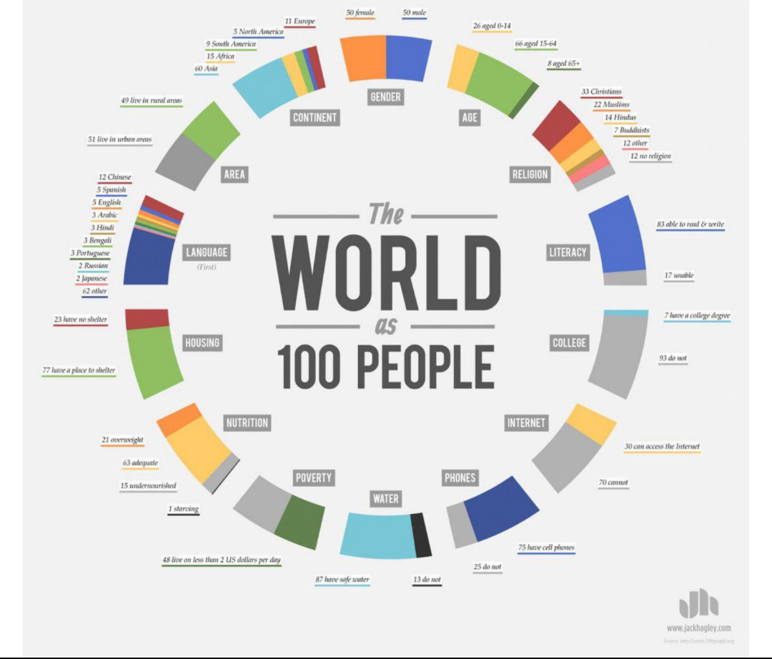
The Role of Age Distribution in Global Demographics
Understanding age distribution is essential for grasping the dynamics of global demographics. Age distribution data, such as the current breakdown of 26% aged 0-14, 66% aged 15-64, and 8% aged 65+, provides critical insights into the population structure. This information is pivotal for planning in sectors like healthcare, education, and economic policy. For instance, a high percentage of young individuals indicates a need for more educational facilities, while a growing elderly population necessitates enhanced healthcare services. Infographics serve as a powerful tool to visually represent this data, making complex demographic charts more accessible and easier to comprehend.
Visualizing Age Distribution with Population Pyramids
Population pyramids are an effective method for visualizing age distribution. These demographic charts graphically represent the population's age and sex structure, providing insights into current demographics and future trends. By illustrating the proportions of different age groups, population pyramids help identify patterns such as baby booms or aging populations. This visualization aids in projecting future demographic shifts and understanding their potential impacts on society.
Age distribution has significant implications for policy-making. Governments and organizations rely on this data to formulate strategies that address the needs of various age groups. For example, a youthful population may require policies focused on job creation and education, while an aging population might drive the need for pension reforms and elder care services. Infographics that clearly depict age demographics facilitate informed decision-making, ensuring policies are tailored to meet the evolving needs of the population.
Moreover, age distribution data influences economic planning and resource allocation. Regions with a large working-age population can capitalize on this demographic dividend to boost economic growth. Conversely, areas with a shrinking labor force might face challenges in sustaining economic productivity. Infographics provide a visual summary of these trends, helping policymakers and stakeholders anticipate future demands and adjust their strategies accordingly.
Economic and Social Implications of Population Growth
Urbanization and resource management are critical challenges associated with population growth. As cities like Beijing and New York experience high population densities, they face significant pressure on infrastructure, housing, and public services. This congestion often leads to decreased living standards, with crowded living conditions and overstretched resources. Effective urban planning and sustainable resource management are essential to accommodate growing populations while maintaining quality of life.
The issue of the "uncounted" represents a significant social challenge in population data. Who are the "uncounted"? They are individuals who are not included in official statistics due to factors such as lack of documentation or residing in remote areas. This exclusion can lead to representation issues, as policies and resources may not accurately reflect the needs of these populations. Addressing the "uncounted" requires improving data collection methods to ensure all segments of the population are considered in decision-making processes.
Pandemics have a profound impact on population statistics. How do pandemics affect population data? They can alter birth and death rates, migration patterns, and health outcomes. For instance, the COVID-19 pandemic led to significant shifts in population dynamics, with increased mortality rates and changes in migration due to travel restrictions. These impacts necessitate adjustments in how population data is collected and interpreted, emphasizing the need for robust and adaptable data systems.
Gender equality plays a vital role in stabilizing population growth. The theme for World Population Day 2023 highlighted the importance of women's rights in achieving balanced growth. Empowering women through education, healthcare access, and economic opportunities can lead to lower fertility rates and more sustainable population growth. By prioritizing gender equality, societies can create conditions that foster stable and equitable demographic trends, ultimately contributing to long-term social and economic development.
Utilizing Infographics for Population Policy Analysis
Infographics play a crucial role in population policy analysis by translating complex data into visual formats that are easily digestible and actionable. By highlighting key statistics and trends, infographics provide policymakers with clear insights into demographic shifts, resource needs, and potential policy impacts. Their ability to distill vast amounts of information into concise visual summaries allows for quick comprehension, aiding decision-makers in crafting informed, effective policies. The integration of essential design elements such as color and layout further enhances clarity, ensuring that the data is not only accessible but also engaging. This visual approach supports public education efforts, making it easier for citizens to understand policy implications and engage in informed discussions.
- Use consistent color schemes
- Highlight key statistics
- Simplify complex data
- Ensure data accuracy
- Utilize clear layouts
- Incorporate interactive elements
In the realm of public education, infographics serve as powerful tools for raising awareness about population issues. For instance, World Population Day harnesses the potential of infographics to communicate vital information on global demographic trends, emphasizing the need for ongoing policy implementation. By simplifying complex data and presenting it in a visually appealing manner, infographics help bridge the gap between data experts and the general public. This accessibility fosters a broader understanding of population-related challenges and opportunities, encouraging proactive engagement and collaboration in addressing these issues. Through their effective use in educational campaigns, infographics contribute significantly to building a well-informed society equipped to tackle future demographic changes.
Final Words
Navigating the complex landscape of world population statistics becomes straightforward with the power of infographics.
From visualizing global trends and age distributions to dissecting economic and social implications, infographics offer a simplified yet comprehensive view.
With detailed visualizations, they are indispensable tools for policy analysis and education.
Their ability to transform complex data into accessible insights is unparalleled.
As the world population continues to grow, infographic effectiveness will remain vital in informing decisions and creating meaningful change.
Harness this potent visual medium to stay informed and inspire action toward a sustainable future.