What if everything you thought you knew about income in the United States was about to change?
The "Household Income by State Infographic" brings eye-opening insights to light, challenging preconceived notions while offering a vivid visualization of income distribution across the country.
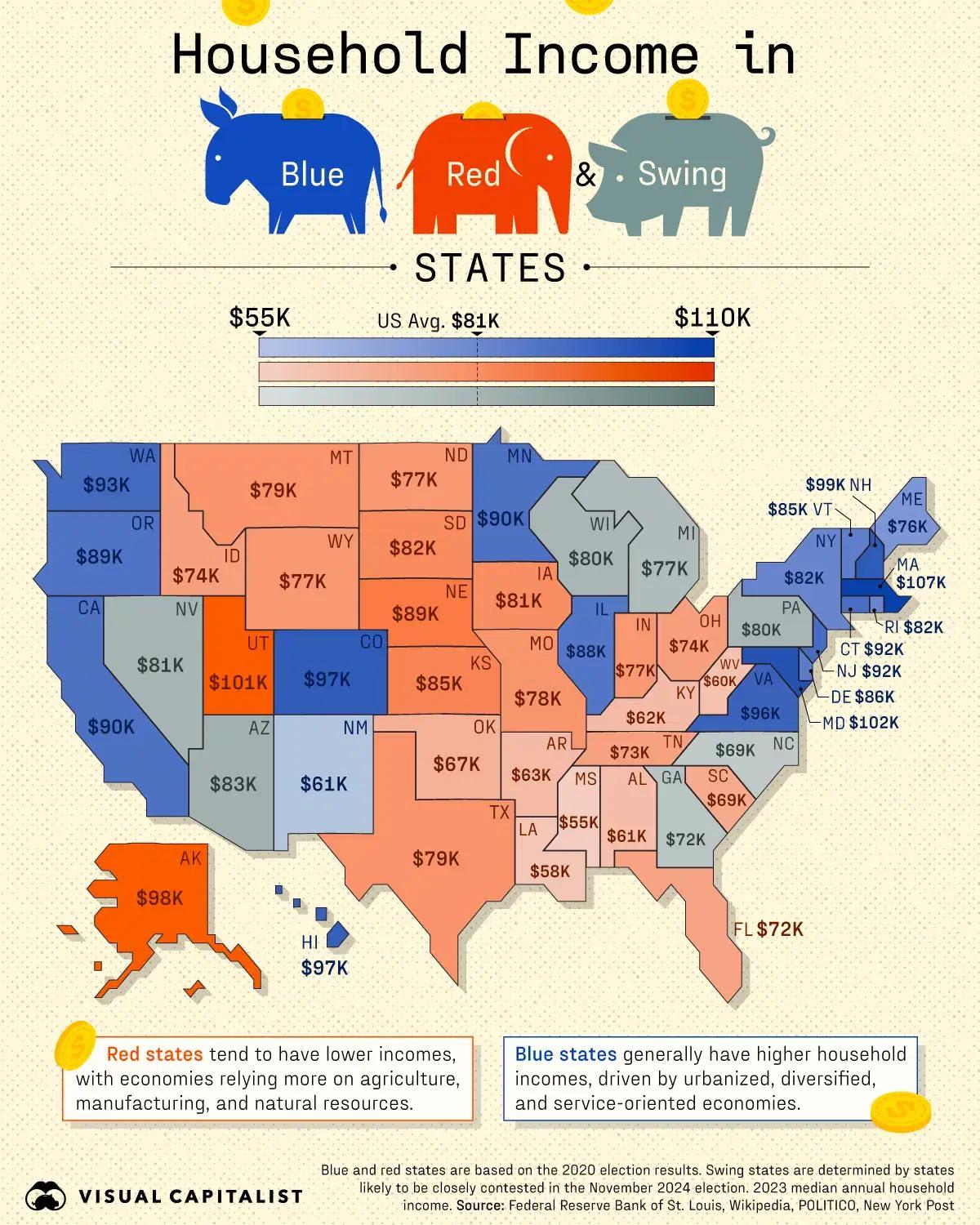
Through color-coded maps and strategic political categorization, it reveals that blue states boast higher average incomes at $99K, starkly contrasting with the $70K seen in red states.
This infographic not only provides a geographical representation but also offers context on how political affiliations align with economic prosperity.
Does your state measure up to these startling statistics, or is it lagging behind? Skip ahead to discover where Maryland and Mississippi stand and what the average U.S. income tells us.
Visualizing Household Income by State
The household income by state infographic offers a compelling visual representation of income data across the United States. It utilizes color coding to distinguish between states, making it easy to identify income levels at a glance. Blue hues represent higher income states, while red hues indicate lower income states. This geographic representation allows viewers to quickly assess regional disparities. States are outlined on a U.S. map, providing a clear and intuitive way to compare incomes across the country.
The infographic also categorizes states by their political affiliation, revealing a notable correlation between political leanings and income levels. Blue states, typically aligned with the Democratic Party, exhibit higher average incomes, around $99K. Conversely, red states, generally associated with the Republican Party, have lower average incomes, approximately $70K. This distinction provides insight into how political and economic factors intertwine, influencing household income across different regions.
- Maryland: $102K
- Massachusetts: $107K
- Mississippi: $58K
- Average U.S. Income: $81K
- General Trend: Blue states have higher incomes than red states
Comparing State Income Levels and Trends
The national median household income in 2022 stood at $74,580, reflecting a decline from previous years. This downward trend marks a significant shift from the steady income growth observed before 2019. Several factors, including economic disruptions and policy changes, have contributed to this decrease. Understanding these trends is crucial for policymakers and economists to develop strategies to bolster income growth in the coming years.
Regional disparities in income are pronounced across the United States. The Northeast and West regions consistently report higher median incomes compared to the Midwest and South. This disparity is often attributed to differences in industrial concentration, cost of living, and urbanization levels. States within the Northeast and West benefit from robust economies driven by sectors like technology and finance, which typically offer higher-paying jobs.
Educational attainment plays a pivotal role in influencing income levels. Individuals with higher education degrees often secure better-paying positions, contributing to higher household incomes. This correlation underscores the importance of education policies that promote access to higher education as a means of reducing income inequality. Investing in education can lead to a more equitable distribution of income across different regions and demographics.
| Region | Median Income |
|————-|—————|
| Northeast | $85,000 |
| West | $80,000 |
| Midwest | $70,000 |
| South | $65,000 |
| National average | $74,580 |
| Educational impact | Higher education correlates with higher income |
Analyzing Income Disparities Across States
What are the primary factors contributing to income disparities across states?
Income disparities across states are significantly influenced by race and gender. Asian and White households generally have higher incomes compared to Black and Hispanic households. This racial income gap persists due to historical and systemic factors that affect educational and employment opportunities. Gender income disparities are also notable, with male workers earning approximately $10,000 more than their female counterparts. This gender pay gap can be attributed to differences in industry representation, occupational roles, and ongoing issues related to gender bias in the workplace. Understanding these disparities is essential for developing policies aimed at promoting equity and reducing income inequality across different demographics.
How does wealth differ from income, and why is it important?
Wealth is distinct from income as it reflects the total accumulation of assets, such as property, investments, and savings, rather than just the flow of money earned through wages or salaries. This distinction is crucial because wealth provides a buffer against economic hardships and offers opportunities for investment and growth, such as starting a business or funding education. Accumulated wealth can significantly impact an individual's or family's financial stability and overall economic mobility. Therefore, examining both income and wealth is necessary to fully understand economic inequality and to create strategies that address not only income distribution but also asset accumulation across different racial and gender groups.
State-by-State Economic Indicators and Rankings
State rankings based on median household income have seen notable changes from 2000 to 2020. During this period, 27 states and D.C. improved their positions, reflecting economic growth and policy adjustments. These improvements indicate shifts in economic landscapes, highlighting areas where strategic development and investments have paid off. Conversely, some states have experienced declines, often due to economic downturns or shifts in dominant industries, impacting their overall income rankings.
The 2022 data provides a comprehensive overview of state income rankings, listing states from highest to lowest median income. This year's rankings reveal that states like Maryland, Massachusetts, and New Jersey consistently top the list, showcasing strong economic performance and higher living standards. On the other end, states such as Mississippi and West Virginia remain at the lower end, pointing to ongoing economic challenges and lower income levels compared to the national average.
Key economic indicators used for these rankings include employment rates, industry presence, cost of living, and educational attainment. Employment rates directly influence household income, while the presence of high-paying industries can boost state economies. Additionally, states with lower costs of living might rank lower in terms of income but offer a different quality of life. Education is another crucial factor, as states with higher educational attainment levels tend to report higher median incomes, underscoring the importance of education in economic growth.
| State | Ranking |
|————–|———|
| Maryland | Top 1 |
| Massachusetts| Top 2 |
| New Jersey | Top 3 |
| Mississippi | Bottom 1|
| West Virginia| Bottom 2|
Creating Interactive Data Presentations
What is the potential for interactive elements in data presentations?
Interactive elements in data presentations allow users to delve deeper into the information, enhancing understanding and engagement. By incorporating features like clickable regions, hover-over details, and adjustable data parameters, users can explore data at their own pace and focus on areas of personal interest. This interactivity transforms static data into a dynamic experience, making complex datasets more accessible and insightful. As users engage with the data actively, they gain a clearer understanding of the underlying patterns and trends, leading to more informed decision-making and analysis.
How do design principles contribute to engaging infographics?
Design principles are crucial in creating infographics that are both engaging and informative. Clarity and simplicity ensure that the information is easily digestible, preventing users from feeling overwhelmed by excessive details. Accurate data representation is vital for maintaining credibility and ensuring that users can trust the insights presented. Engaging visuals capture attention and make the data memorable, while user-friendly navigation allows for seamless interaction, ensuring users can find and explore the information they need without frustration. Together, these principles create a cohesive and effective infographic that communicates complex data clearly and compellingly.
- Clarity and simplicity
- Accurate data representation
- Engaging visuals
- User-friendly navigation
Final Words
Visualizing household income by state offers a compelling look into income disparities across the nation.
The infographic effectively uses color coding and geographic representation to illustrate income differences, mapping political affiliations with income levels.
Exploring these correlations, one finds that blue states generally report higher incomes compared to red states, underscoring a fascinating trend.
Understanding these elements can enrich both educators’ and marketers’ presentations, serving not just as a repository of data but as a narrative tool.
Implementing these insights ensures that such tools mirror the latest trends, offering depth and clarity to any analysis of household income by state.
By blending accurate data with engaging visuals, infographics like these can drive home the essential facets of financial landscapes across the United States, enhancing both educational and strategic endeavors.