
Finance and Economy
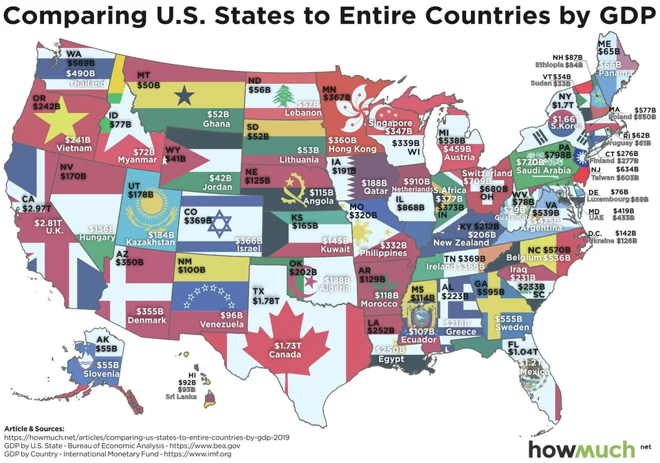
US States GDP Compared to Countries, All 50 States Mapped
In 2025 California's GDP of $4.30 trillion was close to Japan's and bigger than the UK's, Texas at $2.93 trillion out-produced Russia, Italy and Canada, and…

Infographic publisher
HowMuch.net started in 2015 by turning complex money and economic topics into visuals and guides that anyone could use, and its data maps were picked up by outlets such as the New York Times and Bloomberg. It joined the SolarReviews family in 2022 and is now a comparison site that helps you compare insurance, banking, loans and credit cards.
Based in United States
In 2025 California's GDP of $4.30 trillion was close to Japan's and bigger than the UK's, Texas at $2.93 trillion out-produced Russia, Italy and Canada, and…
Is this your work? Tell us about a credit, a correction or a better description, and we will update this page.
Give it a permanent page where people looking for your subject find it, with your name and a link to your site. Content marketers, agencies, designers and researchers all list here.